
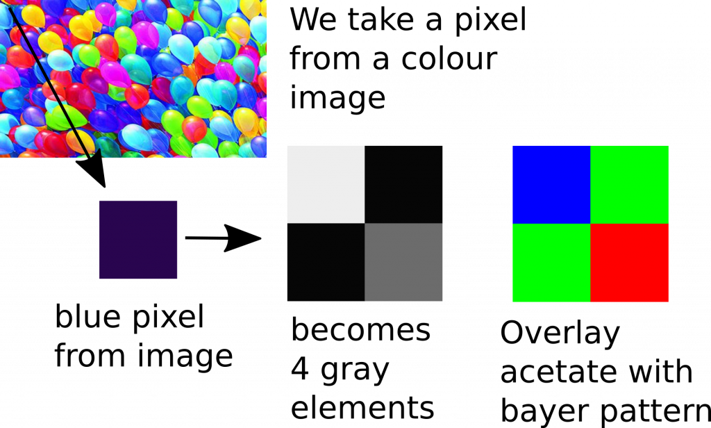
The aim of this project was to display a colour image on a black and white monitor, by overlaying an acetate bayer filter (inkjet printed) over the monitor and mosaicing a colour image.
I obtained an Eizo B&W monitor from ebay, which I was intending for use viewing B&W photos and was curious if I could replicate an effect similar to Autochrome Lumière ( see wikipedia ) where they overlay colour filters over a B&W photographic plate, using starch grains, which creates a colour image.
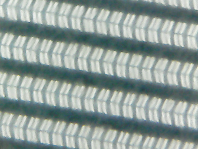
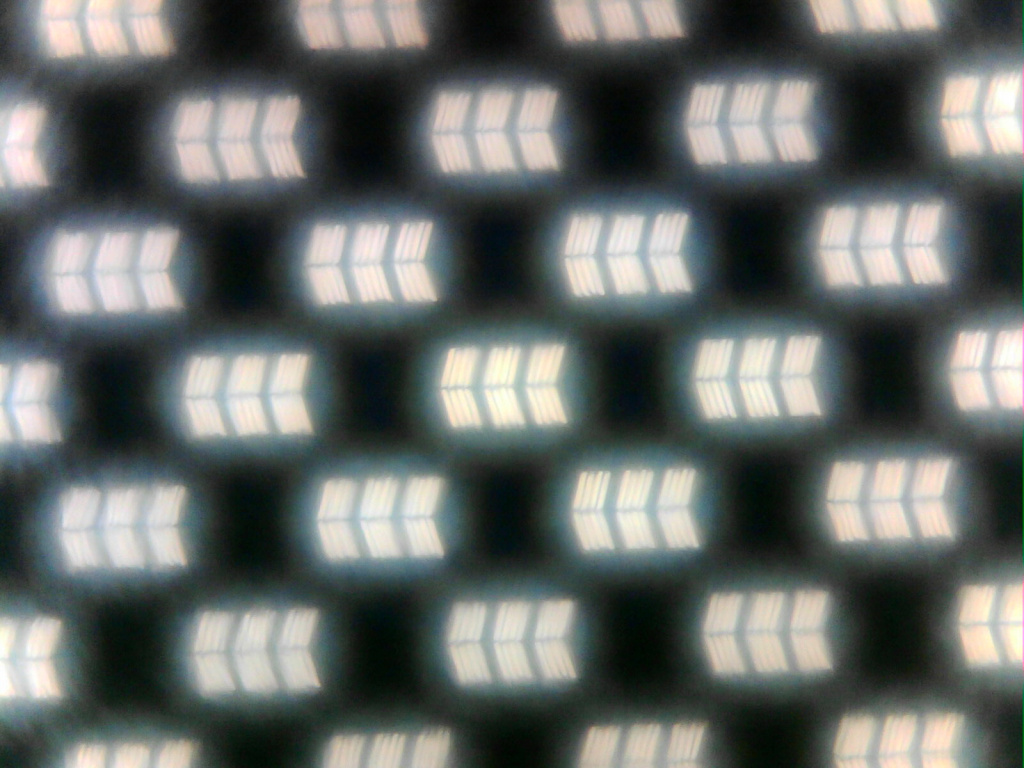
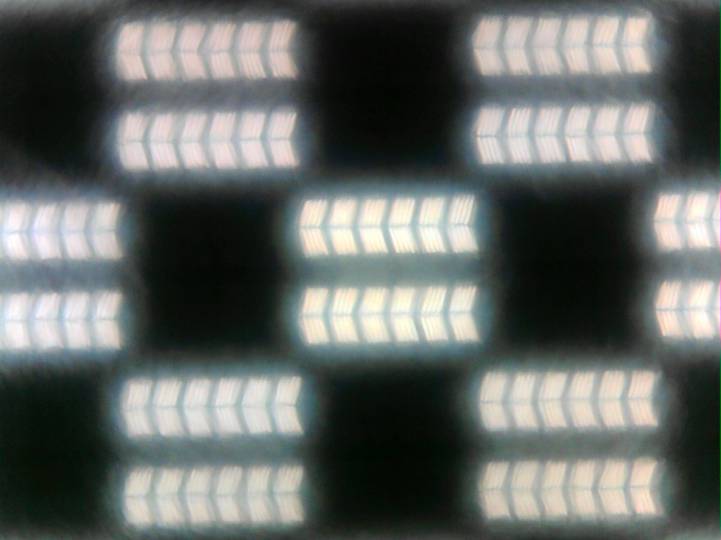
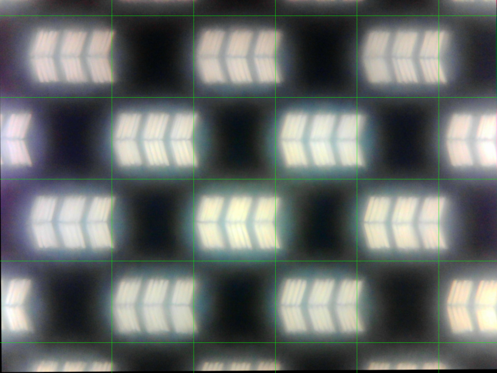
The following image shows a 500x microscope image of the pixels that make up the B&W LCD display, taken using a cheap USB microscope. It looks to me as if each pixel, is represented by 4 sub-pixel elements, please correct me if this appears not be the case. (Edit: It seems a pixel is 3 groups of ‘<‘ shapes, see below for more information)
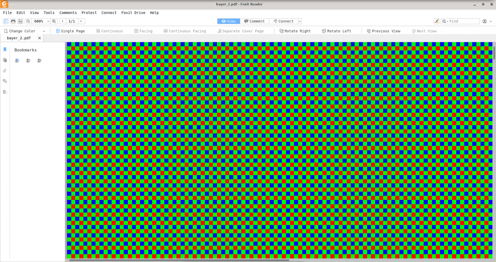
A pdf was created of the bayer pattern, with the dimensions 433.1mm x 324.8mm. The monitor has a resolution of 2048×1536 and I assumed the pixels had the same width as height.
You can see an example of the pdf I created below, where for example a blue element, should be represented by 2×2 pixels from the B&W monitor.
I created 3 pdfs:
- bayer_1.pdf – each element, is represented by 1 pixel from the display
- bayer_2.pdf – each element, is represented by 2×2 pixels from the display (this is the acetate used in the video)
- bayer_4.pdf – each element is represented by 4×4 pixels from the display
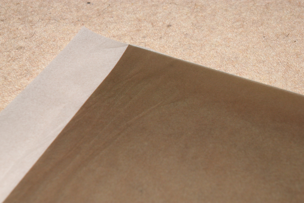
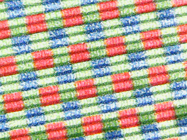
The following image shows the printed acetate with the bayer pattern:
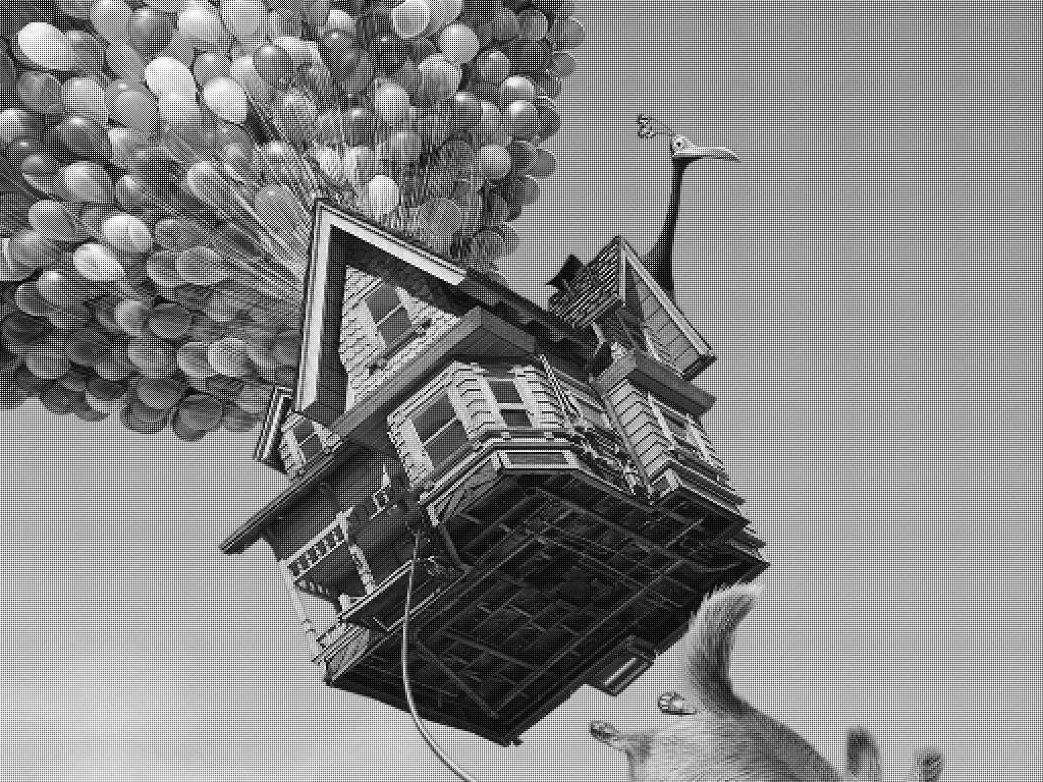
The following, is a B&W image with mosaicing applied from the colour image:
How it works
The monitor I am using seems to generally be used portrait, to make it landscape on linux:
xrandr --output HDMI1 --rotate left
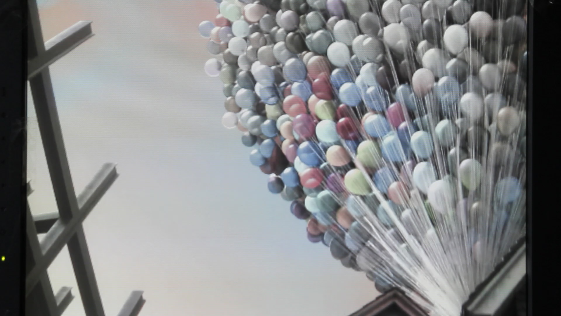
Image of effect
As you can see the effect of my attempt is quite slight, but you can see in the centre the different colours of the balloons.
Video of effect using inkjet printed acetate
The effect is also demonstrated in the following video, with the following parameters:
mpv out.mkv --fullscreen --loop --brightness=10 --contrast=20
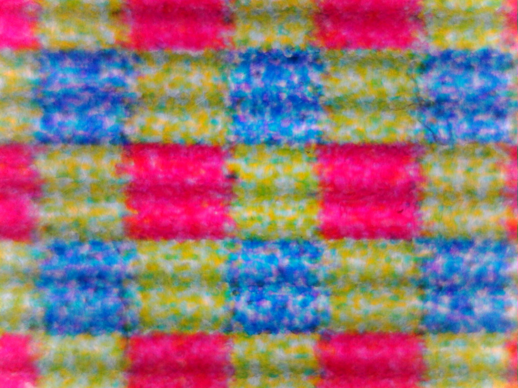
Microscope images of the bayer filter (2×2 scaling)
2×2 bayer filter, I tried to design it so that for example the ‘red’ square covers 2×2 pixels on the monitor
Chess board
As suggested by Olivier, I’ve just created 2 chess board images. Olivier was correct that a single pixel consists of 3 sub-pixels 🙂
1×1 (the white patch is 1 pixel), monitor in landscape, image in correct orientation from microscope (left, towards left monitor, top, towards top of monitor)
2×2
Microscope micrometer
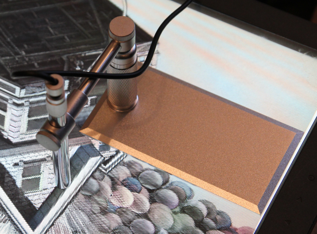
I made use of a 2×2 chess pattern and a 1mm microscope micrometer with 100 divisions. By my initial calculations I anticipated around 0.42mm x 0.42mm for the size of each black/white block, which seems to roughly tally with the measurements below.
It was hard to get both the pixels and rule in focus at the same time, I used the micrometer slide upside down also, so the print was closer to the pixels, as the microscope has a very shallow focal plane.
Using the micrometer in a vertical orientation, to measure the size of the ‘chess’ squares.
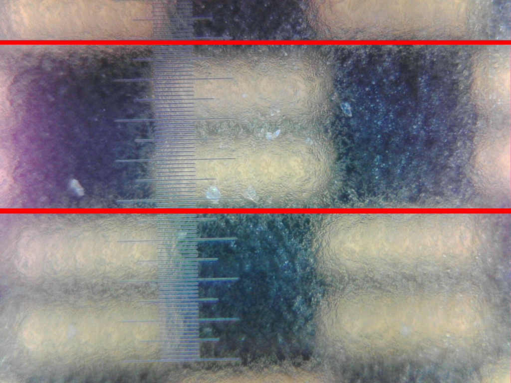
I found it was better to use the microscope micrometer as calibration for the microscope, rather than a ruler. I took a photo of the micrometer at 500x magnification. I made a simple script that determines the positions of the lines and measures the total length of the micrometer at 1mm. This told me 1241.5 pixels equates to 1mm.
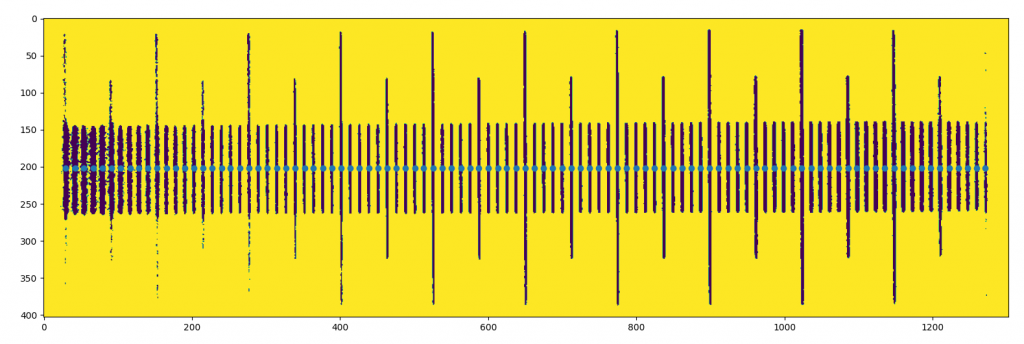
Using the values from my initial calculations combining the width of the panel and the number of pixels which means 0.21mm x 0.21mm for each pixel.
I used the value from the micrometer of 1241.5 pixels for 1mm and did:
0.21147460937*1241.5 = 262.5
= 263 pixels for a pixel width/height and drew lines every 263 pixels, for the centre of the image
Which seems to indicate a value of 0.21mm x 0.21mm seems sensible.
Possible improvements
I wonder if by measuring the exact pixel width/height under a microscope, if the effect could possibly be improved somewhat, as that information could be used when creating the acetate filter.
- I have tried this now and think the values I’ve chosen seem sensible
Alignment is also a key issue, I need to think of ways to improve that, possibly using a microscope while aligning the acetate.
The following image shows the inkjet acetate, I’m wondering if using a photographic developing process (such as duraclear) instead may give better results.
- See the video at the bottom of the page for improved results using duraclear
I’d be interested in other improvements I could make too!
New improved attempt using duraclear
The following video depicts a new attempt using a photographically developed film known as duraclear:
Source
The sourcecode to generate the PDFs for the acetate and the mosaiced images and videos is at:
https://www.github.com/anfractuosity/rainbow
Olivier Parmentier
Seems to me that the screen has exactly the same structure as a color screen.
Each block of “<<“ structure is a subpixel on a color screen so I would guess that a pixel is 3 of those blocks addressed by the controller as one b&w pixel.
You can test this hypothesis by sending a chessboard pattern on the screen et look with the microscope.
To adjust the dpi of the bayer print. Guess a good enough approximate. Print it, then when it’s on the screen display one color (red for example) and count the moire effects. That would give you the information to adjust the dpi of the print.
admin
Thanks a lot for your comment. I’ll definitely have to try that, regarding the
chessboard pattern and microscope, and the dpi information you gave!
Peter McNeeley
Ive done some experiments with lenticular sheets so im aware of some of the difficulties here.
Im wondering if in addition to alignment issues you also dont have a parallax viewing issue. You might need to adjust for that.
admin
Thanks :), it does look like the camera needs to be pretty parallel to the monitor. I will look at this more.
Michael
I notice the color is clearer in the center and more grey on the edges. Is this an old tube monitor? The glass is usually curved, so the geometry may not be an even grid. You might need to create a curved projection for your color filter,
admin
That’s a good point, but it’s a B&W LCD monitor. I’ll have to have a think why
the colour is more prevalent in the centre.
Xyzzy
If you move the camera, and the centre-spot of colour moves with it, it’s likely parallax? The more oblique the viewing angle, the less the three components (camera, acetate, LCD panel) line up.
admin
Thanks for your comment, I will look into this more, it does seem like the camera does
need to be pretty parallel to the monitor.
Matt Burns
Yeah, so is it the gap between the pixels and the acetate? If so moving the camera further away and zooming in should make the coloured region grow.
Douglas
One trick would be to do it all back to front. Instead of saying, “this pixel will be green”, then very precisely placing a green mask over just that pixel, you could place a mask that is pretty close over the screen, iterate over the pixels lighting one up at a time, recording what colour it goes (some combination of red green and blue). To show a colour image, lighten the pixels based on how much of that composite colour is needed.
admin
That’s a very cool idea. I think that would be really interesting to try!
Matt Burns
Excellent idea, but you would definitely want to automate that 😉
Anna
I have nothing to say beyond – this is incredible. Nice!
tepe
This is cool. It’s essentially how the original OLPC screen did color. (See http://wiki.laptop.org/go/Display#Screen)
owen
This is impressive stuff.. doing more with less is a noble venture. Think of all we could achieve if we weren’t wasting compjting power on react interfaces.
Hirudinea
Isn’t this closer to Dufaycolour than Autochrome Lumière, not to be pedantic. But besides that very nice.
https://en.wikipedia.org/wiki/Dufaycolor
admin
I hadn’t heard of that before, thanks for pointing that out 🙂 It does look more similar
to that!
It’s also interesting that it mentions film under that process continued to be produced until the 1950s.